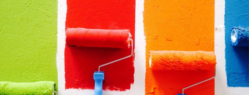
Different coloured stripes being painted onto a wall

Colour Theory

By Christian Watson

Colour Theory is both an art and a science. It is about how each of us perceives the colour we see, and how that makes us feel. Colour can communicate thoughts, feelings, and emotions - sometimes better than words can. 

So much of this communication is what we are seeing immediately, out of the corner of the eye, or right in front of us. Everyday we are bombarded with so much colour, that sometimes you pay it no attention; but every now and then, you see a colour, and something stirs inside you.  

Essentially, the science of colour is to do with the reflection of light off of objects and into our eyes, where it is detected, sent off and translated in our brains into what we call colour. 

Before we go into what different colours communicate and what certain colours make us feel, I think it’s wise to refresh ourselves with some basic colour science. (Skip ahead if you remember our article on Colour: The Basics !!) 

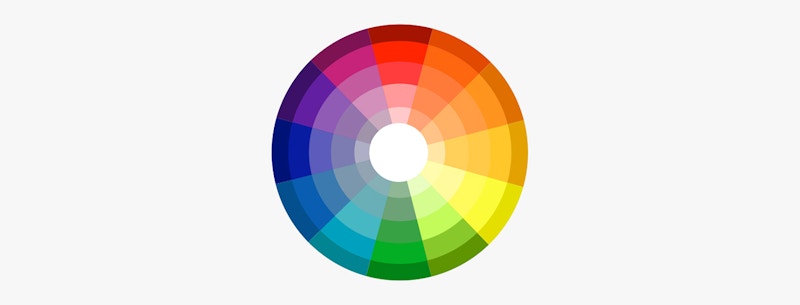
The Colour Wheel consists of three primary colours (red, yellow, blue), three secondary colours (colours created when primary colours are mixed: green, orange, purple) and six tertiary colours (colours made from primary and secondary colours, such as blue-green or red-violet).

Colour Wheel

If you draw a line through the centre of the wheel, you’ll separate the warm colours (reds, oranges, yellows) from the cool colours (blues, greens, purples).

Still with me? Now here’s where it gets a little trickier.

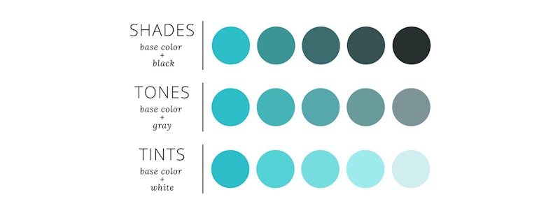
As you look at the colour wheel, you may be thinking, but there are wayyyy more colours than this!! This is where we start talking about Hues, Tints, Shades and Tones. Simply put, tones and shades are variations of hues, or Colours, on the Colour wheel.

Tint is a hue to which white has been added. For example, red + white = pink.

Shade is a hue to which black has been added. For example, red + black = burgundy.

Tone is a Colour to which black and white (or grey) have been added. This darkens the original hue while making the Colour appear more subtle and less intense.

An image describing colour in shades, tones and tints

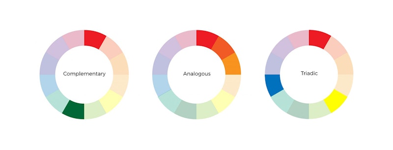
Complementary Colours

Complementary Colours are opposites on the colour wheel—red and green, or Blue and Orange.

Because there’s a sharp contrast between the two colours, they can really make imagery pop, but overusing them can get tiresome as the contrast can be off-putting.

Analogous Colours

Analogous Colours sit next to one another on the colour wheel—red, orange and yellow for example. In an Analogous Colour scheme, one colour will be used to dominate, one will support, and another will accent.

 Analogous Colour schemes are not only pleasing to the eye, but can instruct the viewer as to an action or direction.

 Triadic Colours

Triadic Colours are evenly spaced around the Colour wheel and tend to be very bright and dynamic. Draw an equilateral triangle in the middle of the wheel and each corner will point to a triadic colour, keep spinning that triangle and you can get some great combinations.

Using a triadic Colour scheme can be used to contrast and harmonise simultaneously, making each item stand out, while also making the overall image pop. These are actually far more common than you think in logo design.

So now that little colour catch-up session is done, we can talk about how these colours make us feel, and what certain colours communicate.

Complementary, Analogous, Triadic colour wheels

Colours and Emotions

Colours can make us feel happy, sad, energetic, calm and so much more, they can even make us feel hungry or sleepy. These reactions are rooted in psychological effects, biological conditioning and cultural imprinting.

The way different Colours affect emotions depends largely on a Colour’s brightness, shade, tint or tone and whether it’s a cool or warm hue or tone.

Warm Colours

If you remember earlier when we drew a line down the centre of the colour wheel, we got warm and cold colours. Red, orange and yellow are all warm Colours.

Generally speaking, warm colours often evoke feelings of happiness, optimism and energy. However, yellow, red and orange can also have an attention grabbing effect and signal danger like hazard warning signs or police tape. 

Weirdly enough, Red can also increase a person’s appetite and make them feel hungry. Maybe that’s why everyone loves Coca-cola or McDonalds..?

Red Coca-Cola Logo and a Yello McDconalds Logo

Cool Colours

Cool Colours such as Blue, Purple and Green are usually calming and soothing but can also express sadness. Purple is often used to help spark creativity as it’s a mixture of blue (calm) and red (intense).

Happy Colours

Think Happy, think warm colours. Bright and lighter colours like yellow, orange, pink and red are more uplifting and happy, while pastel colours like light pinks and baby blues are also happy and optimistic. They are also associated with childhood and have an almost youthful exuberance.

Sad Colours

Think Sad (don’t actually), think cold colours. Sad Colours are generally Colours that are darker and more muted. Black and grey are the quintessential sad Colours associated with death and mourning, but dark and muted cool Colours like blue, dark green or neutrals like brown or beige can have a similar effect on feelings and emotions depending on how, and where, they are used.

Calming Colours

Colours like blue and green can make you feel calm, especially ones that are reminiscent of nature and the sea. Lighter Pastel Colours are very ‘cooling’ like baby blue, soft yellow and moss green have a calming and relaxing effect.

Neutral colours can also have a calming effect, white, beige and grey can work in certain environments. More often than not, the fewer Colours you combine and the simpler and more pared back the design, the more calming it will feel.

Energizing Colours

Strong, bold, bright Colours, as well as neon Colours, can have a powerful effect on emotions. Bright red, yellow and neon green can feel energizing and vibrant as well as make you feel more alert. They can also be quite garish and make people feel uncomfortable in big swathes.

Bright energising colours will grab your attention and stand out from their surroundings. Highly pigmented, strong Colours like royal blue, turquoise, magenta and emerald green can also have a stimulating effect and make you feel refreshed and energized.


So how do individual colours make you feel? 

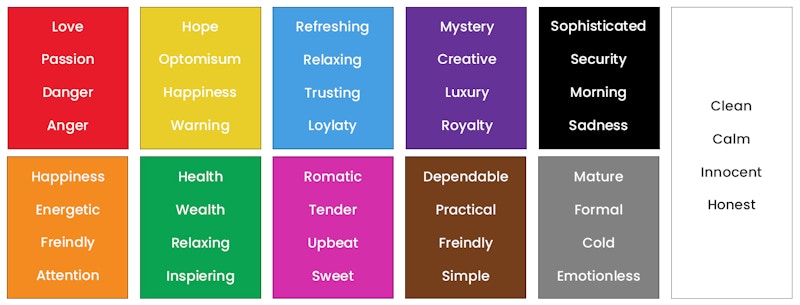
Red makes you feel passionate and energized.

Red is the warmest of colours and triggers some conflicting emotions. Love is red, Passion is red, yet so is danger and anger. Red has been proven to increase the heart rate, a sign of both love and danger and, as said above, can even increase your appetite.

Orange makes you feel energized and enthusiastic.

Orange communicates a feeling of happiness, animation and spirit. Much like red it can draw attention but is not as overpowering. It is bold yet more reserved than red is, it is energetic yet slightly friendly.

Yellow makes you feel happy and spontaneous.

Of all the warm colours, Yellow is the most energetic and lively. Yellow is sunshine and hope. It is an optimistic colour and communicates drive and happiness. However, it is also a colour that many people find very distracting, as it reflects a lot of light that can be overwhelming.

Green makes you feel optimistic and refreshed.

Green symbolizes health as well as wealth and is very easy on the eye, reflecting a good amount of light while remaining balanced. It is refreshing and relaxing while being optimistic and inspiring. The colour of nature, green also symbolises growth, rebirth and new beginnings.

Blue makes you feel safe and relaxed.

The favourite of all the colours, when seeing blue the body actually releases chemicals that relax. It is calming, refreshing and relaxing.

Purple makes you feel creative.

I think I may be the only one whose favourite colour is purple! Purple is associated with mystery, creativity, royalty, wealth and luxury.

Lighter shades of purple like violet are often used to soothe or calm the viewer, while the darker shades are more regal and luxurious.

 Pink makes you feel playful and romantic.

Pink represents femininity and romance, sensitivity and tenderness. It’s inherently sweet, cute and charming, upbeat.

Brown makes you feel humble and down to earth.

Brown is traditional and creates a sense of stability and support. It is warm, friendly, practical and dependable.

Black feels sophisticated, serious and sad. 

Black is bold and powerful, it evokes luxury, elegance, professionalism and simplicity. However, Black can have some negative connotations being the Colour of mourning, fear and sadness. It can feel intimidating and unapproachable as well.

White makes you feel pure, fresh and clean.

White evokes purity and innocence and creates a minimalist aesthetic. It can be very simple, clean and modern. It’s also the most neutral Colour of all. It creates space, evokes natural light and is upbeat and calm. It is also a symbol of new beginnings, potential and rebirth.

 Grey feels serious and professional.

As opposed to Black, Grey is a more mature and responsible Colour. Its positive connotations include formality and dependability, professionalism while being contemporary. While the negative side can mean being overly conservative, traditional, cold and emotionless.
Examples of how colour can effect your mood and emotions

The emotional link

When looking down this list it is important to remember that Colours are subjective. Depending on their opinion, past experiences and feelings at that time, what might make one person feel cheerful can make another person feel irritated or sad.

Colour is not completely agreed on universally and can appeal differently to individual countries as cultural differences emerge.

Regardless, Colours and emotions are inextricably linked no matter what, so you need to take their effects into account whenever you are using Colours.

Previous post

As always, we’d love to hear what you have to say. So let us know what you think or if you have any questions or comments! You can email me or a member of the team via the website contact page or at make@christian-watson.com

We look forward to hearing from you. Follow us on Instagram to see our latest goings on and sign up to our newsletter to receive all our updates and articles!

Next post

Disclaimer

This blog is a non-profit educational facility for a worldwide community. All images are taken under the Education Fair Use title. All images used are sourced by us for use in educating and informing our audience to the best of our ability. If any persons or agencies find us in fault and would like us to stop using their image/s please contact us directly and we will remove the image indefinitely without issue.