Various open cans of paint in an artists studio

Colour - The Basics

By Christian Watson

How we see colour

So, the perception of colour takes place in our mind. This is something that needs to be said early! Waves of light are received in the little lens in our eye and sent to the brain to be interpreted as colour.

Much like radio waves, these light wavelengths have different sizes measured in nanometers. Nanometers are a unit of length in the metric system, equal to one billionth of a metre. That is so so so so small; and each small bracket of wavelength size is equal to a different colour. For example, Red is between 780 nm -658nm. At 658nm it blends into orange and then yellow between 658 nm – 600nm.

You see light is divided into these brackets, much like when you see a rainbow each colour is its own layer, separate from the colour next too it. However, it’s not quite as distinct as that. When you look at a rainbow in real life the colours seem to bleed into one another. That’s because each colour has colours in between it that our eyes can’t distinguish and interpret as a colour, so it seems like a kind of haze.

A beautiful landscape of mountains with a rainbow streaking across it.

When we look at something colourful, a lemon for instance, light is bouncing off of it’s surface. When it does that, some light is absorbed, and some light is reflected off. The light that is reflected off hits our eyes, our brain interprets it, and we see a colour. So something as bright yellow as a lemon, is predominantly absorbing all the colours apart from yellow.

The main principles of colour

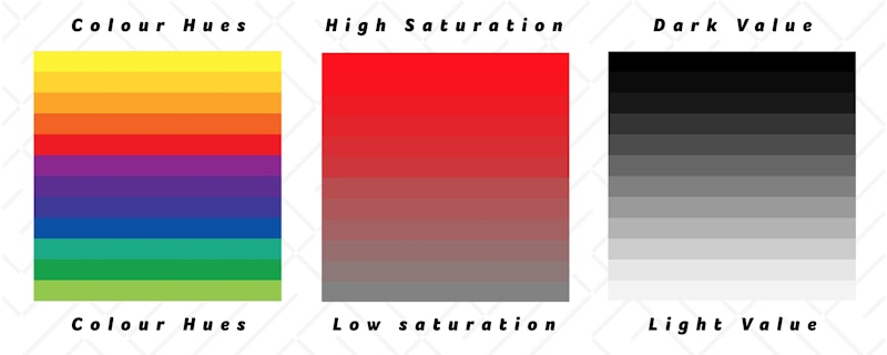
There are three main principles of colour, Hue, Value and Saturation. Let’s talk briefly about each one.

Hue

Simply put, hue is just a fancy word for colour. As we know, every colour is a bracket of wavelengths which merges into other colours. In theory, somewhere in the middle of the bracket is a solid, pure colour.

This however is hard to pin down precisely as the colour spectrum is basically an infinite amount of hues with individual wave lengths. So, the idea of a pure red or blue is more of a mental one, as people’s idea of the true blue may be different. One person may be imagining Sky Blue, the other more of a Navy. These are both Blue but different sides of the blue spectrum.

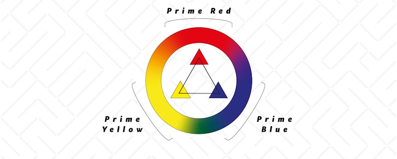
You may of heard people talk about colour temperature. They may have said something like a warm red, or a cool blue. The diagram below goes a long way to describe it. This is the Hue continuum, it depicts two sides of a donut, the right side depicting cold with the left representing warm. Where these two sides meet is green and red. That is because both green and red transition into both warm and cold.

Example of Colours hues, Saturation and Value

Value

Value is how light or dark a colour is, or how ‘luminous’ it is. The more light a colour, the more luminous it is. The more luminous, the more the light it reflects back at us. So a purely white and a purely black piece of paper are the opposite sides of the spectrum.

Just like the Hue continuum, the Value continuum displays an infinite amount of variations. Its aim is to display the spectrum of all the colours in between that sheet of white and black paper.

The colour triad is 3 places on the colour continuum, one at each edge of a triangle. Yellow, Red and Blue are each colours that are so different from one another, that none of them is the dominant colour. This is because they are at each end of the equilateral triangle, therefore equidistant from each other.

Yellow however, is far more luminous than Red and Blue. Yet, Red and Blue have the same Value. Have a look at the chart provided.

An image detailing the colur triad, red, blue and yellow on the colour continuum
Previous post

As always, we’d love to hear what you have to say. So let us know what you think or if you have any questions or comments! You can email me or a member of the team via the website contact page or at make@christian-watson.com

We look forward to hearing from you. Follow us on Instagram to see our latest goings on and sign up to our newsletter to receive all our updates and articles!

Next post

Disclaimer

This blog is a non-profit educational facility for a worldwide community. All images are taken under the Education Fair Use title. All images used are sourced by us for use in educating and informing our audience to the best of our ability. If any persons or agencies find us in fault and would like us to stop using their image/s please contact us directly and we will remove the image indefinitely without issue.