A black Qwerty keyboard

Design Principles - Performance

By Christian Watson

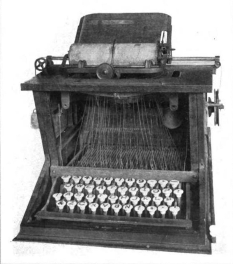
The QWERTY keyboard was developed by Wisconsin’s own Christopher Latham Sholes in 1870 . Sholes was a newspaper editor and printer who with his friends developed the keyboard for a typewriter they were making.

The typewriter had some major flaws however and so did the original layout, so after months of playing around, the typewriter was adjusted, and the keyboard with it. Sold to the now infamous brand Remington, the QWERTY keyboard took its final steps to become much like it is today.

Everyone who has ever used a laptop knows the QWERTY layout right? However, we (I) began wondering, has there never been a better alternative? Or even just an alternative?

Enter Mr August Dvorak and his simplified keyboard. That sounds like a terrible movie. It was developed in the early 1900s and patented in 1936; the simplified keyboard offered a completely new layout and typing system. So what’s the difference. Well, everything.

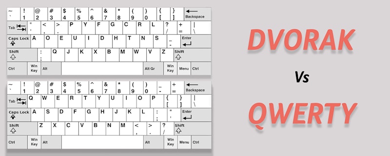
Now, there is an argument that the Dvorak keyboard is optimised for faster typing because it was developed solely for the English language. This optimisation means that the pairings of keys adds to less finger movement when typing, and therefore less energy expunged, less time taken to reach keys, therefore the faster typing and the less mistakes made.

The difference between QWERTY and a DVORAK keyboard

While Sholes considered the feedback of telegram operators important to the development of a comfortable keyboard, Dvorak studied the physiology of the hand as well as letter frequencies to develop a faster and more efficient keyboard. It does this by cleverly pairing the keys together using a Top row, Home row and Bottom row. During his study he came up with following principles:

• All the letters should be typed by alternating between hands (which makes typing more rhythmic, increases speed, reduces error, and reduces fatigue).
• On a Dvorak keyboard, vowels and the most used symbol characters are on the left (with the vowels on the home row), while the most used consonants are on the right.
• For maximum speed and efficiency, the most common letters and bigrams should be typed on the home row where the fingers rest, and under the strongest fingers (70% of keyboard strokes on the Dvorak Simplified Keyboard are done on the home row and only 22% and 8% on the top and bottom rows respectively).

• The least common letters should be on the bottom row which is the hardest row to reach.
• Most of the world population are right-handed, therefore the keyboard designed to make the right hand do more work than the left.

Now everyone has a QWERTY keyboard on all of their devices

Now, most of the records for speed typing and typing duration are held by using a Dvorak keyboard. To this day, most operating systems will give you the option to switch to a Dvorak keyboard, but the problem still remains, that unless on a touch screen, your keys are still in the wrong place making that switch extremely unlikely.

Most people agree that one of the main reasons it was never adopted was the fact that when introduced in the late 1930’s the world was already using the QWERTY keyboard, and the switch was just too time consuming and expensive. At a time in history when news was beginning to reach the farthest corners of the world, adopting a different keyboard was seen as unnecessary.

It is interesting to think however, that if you offered people the chance to type 30 % quicker, with far fewer mistakes, as well as have the ability to type for longer, they would snap up the opportunity. However, to his day it is still a novelty rather than being considered a norm.

Typewriter Keys

I use this example is because it is imperative for all designers to look beyond obvious advantages and design principles to look at the many small, and sometimes hard to see factors of why people make decisions on why they like, want or use items. Sometimes it has nothing to do with performance, but many of these small but nevertheless important factors. Does it look pleasing, do they want to use it because it is inviting? Does it challenge norms that make people feel uncomfortable or inviting?

The best way to make these factors more visible is to get people to interact with the design. When you ask someone why they use an item, why they chose something, or why they prefer it to something else, the reasons are usually pretty poor. Generally we are bad at looking at the things in our lives that benefit or inhibit our performance and directly specify why it is a positive or negative.

Describing what you’re doing while using it is far easier than afterwards. Being able to show someone why you do or don’t like something rather than use language you’re not familiar with to describe something that the feeling of positivity of negativity has already left your system.

Previous post

As always, we’d love to hear what you have to say. So let us know what you think or if you have any questions or comments! You can email me or a member of the team via the website contact page or at make@christian-watson.com

We look forward to hearing from you. Follow us on Instagram to see our latest goings on and sign up to our newsletter to receive all our updates and articles!

Next post

Disclaimer

This blog is a non-profit educational facility for a worldwide community. All images are taken under the Education Fair Use title. All images used are sourced by us for use in educating and informing our audience to the best of our ability. If any persons or agencies find us in fault and would like us to stop using their image/s please contact us directly and we will remove the image indefinitely without issue.